Data-Visualization-Projects
| home page | visualizing debt | critique by design | final project I | final project II | final project III | Repository |
Visualizing Government Debt
Part 1 - Working with web-based visualization tools and data (OECD)
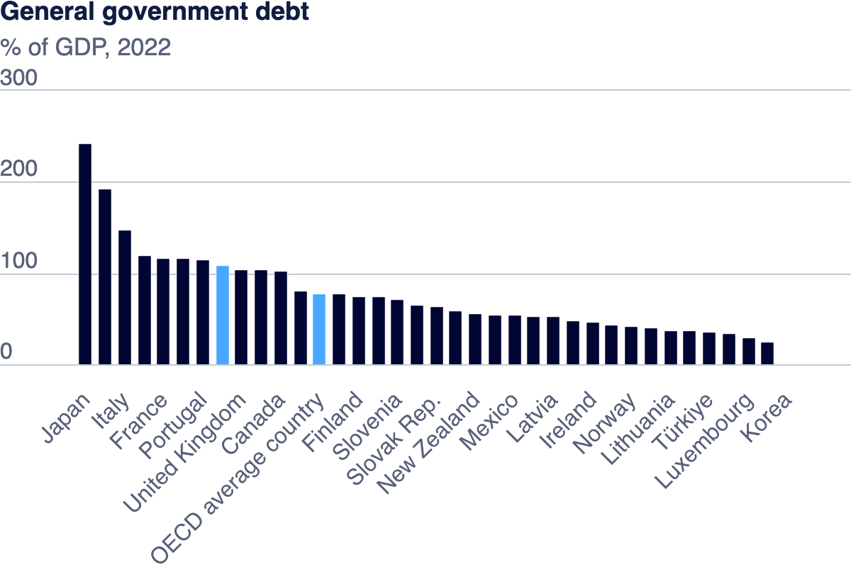
Graph by OECD, Source OECD Data Explorer
- This graph shows the General government debt as a % of GDP (2022) from the OECD official website.
- The chart compares the debt of the different countries and sorts them in descending order, making it easy to see which countries have the most debt.
- The chart highlights the OECD average, making it easy to understand which countries are above or below the average.
Part 2 - Working With Tableau (Heat Map)
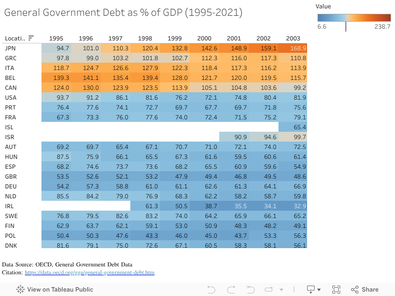
Here is the heat map of the General Government Debt as a % of GDP from 1995 to 2021 from OECD:
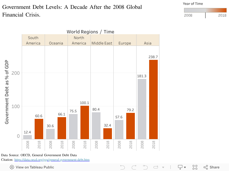
Part 3 - A Decade After the 2008 Global Financial Crisis
This graph presents the general government debt as a percentage of GDP for various world regions (South America, Oceania, North America, Middle East, Europe, and Asia), comparing debt levels between 2008 (the year of the global financial crisis) and 2018 (a decade after the crisis).
What the Graph Shows:
- The graph highlights how different regions have either recovered or worsened in terms of their government debt levels as a share of their GDP after the financial crisis.
- By comparing 2008 to 2018, we can see which regions have taken on more debt and which have shown signs of recovery or improvement in managing their debt.
In terms of the design:
- The years 2008 and 2018 are displayed for each region to compare the two time periods.
- Each bar is labeled with the exact percentage, making it easy for viewers to see the debt levels without having to estimate from the axis.
- The use of two distinct colors – gray for 2008 and orange for 2018 – effectively differentiates between the two time periods. This color scheme makes it easy to compare the debt levels at a glance, without confusion. The orange color signifies the more recent data (2018) as that is the focus of the graph, and the gray color marks the debt levels at the time of the 2008 global financial crisis.
- The graph focuses on regions rather than individual countries, which provides a broader view of the global debt situation. By grouping countries into continents or large regions, the visualization makes it easier to see patterns and regional economic health.
Key Insights:
- Asia stands out as having the highest government debt both in 2008 and 2018, with a sharp increase from 181.3% to 238.7% of GDP, suggesting that the region has struggled the most with managing debt levels post-crisis.
- North America also experienced a significant rise in debt, increasing from 75.5% in 2008 to 100.1% in 2018. This indicates ongoing challenges in controlling debt levels.
- South America saw the most dramatic rise, going from a very low level of 12.4% in 2008 to 60.6% in 2018, which could indicate fiscal policies leading to increased borrowing over the decade.
- Oceania and Europe saw moderate increases, but their debt levels remained somewhat stable compared to regions like Asia.
- The Middle East showed an improvement in debt management, with a decrease from 57.6% in 2008 to 32.4% in 2018, indicating stronger recovery and fiscal discipline in that region.
Comparison of different methods of visualization
-
The first visualization is a bar chart that focuses on a more recent snapshot (2022), showing government debt as a percentage of GDP across individual countries. This visualization highlights current debt levels at the national level, enabling a direct comparison of individual OECD countries. The use of highlighted countries and the OECD average makes it easier to benchmark specific nations, while the simple layout ensures clarity. However, it lacks the historical context offered by the other visualizations, focusing solely on a static year.
-
The second visualization is a heat map that shows the general government debt as a percentage of GDP from 1995 to 2021 across various countries. This method represents time-series data, allowing viewers to quickly spot trends and outliers through color gradients. Countries with higher debt levels, like Japan and Italy, are marked by warmer colors, making it easy to compare debt levels over time. However, while it excels in showing long-term changes, it can be overwhelming when many years are compared simultaneously, and it’s harder to discern specific figures at a glance.
-
My third visualization, a bar chart, compares debt levels across world regions for 2008 and 2018. It uses two distinct colors to highlight changes over the decade, making it simple to compare specific years. The bar chart is effective for showcasing the specific use case (distinct comparisons between years and regions) but lacks the granularity of the heat map, which covers a much broader time frame and individual countries. The clarity and simplicity of this visualization, however, make it a better choice for a focused analysis of the global financial crisis’s impact a decade later. For this assignment, I chose the bar chart because it directly compares the government debt in 2008 and 2018, which is crucial for understanding regional recovery after the global financial crisis. It provides a clear, focused visualization without overwhelming the viewer with too much information.
Sources: OECD Data Explorer